
Te Whangai
UX Design
Te Whangai UX Design

UX Design and Branding for Te Whangai
As the solo UX designer in this phase, create the first iteration of a well-being dashboard for a not-for-profit organisation, Te Whangai, from scratch with me. Follow along with my thought process and scroll to the bottom to see the process and results.
Looking for a memorable experience for your user?
Branding, design and user experience mean a business worth coming back to. It’s all about how you make someone feel.
User Research and Design Development
User Experience means it’s easy for your users and managers.
Making it something to come back for. Loyalty is key.
Complete it with design and branding make your business memorable.

Te Whangai Key Principles

Mental health understanding to ensure key features are understood

Five Whys. A key exercise to develop the brand and is important for all aspects of your business. From internal communications to logistics, give someone a why to create a business that works together.

User Story for the patient, employee or seeker of care

User Story for the evaluator, therapist, manager, employer or carer

Customer or User Journey to display how someone may go through the process when thinking of using a wellbeing, mental health app to regulate their emotions and track how they are feeling.

Affinity Map to show the main levels of the app.

I decided to create some key goals to focus the design process when creating the dashboard.

Persona Creation 1

Persona Creation 2
Wireframing and Conception
Now, let’s get to the more practical step that puts your thoughts to real life.

Wireframe for login page and dashboard. Once I had these I started to create pages from the main design without wireframes to save time.

Information Architecture, sitemap, menu flow for
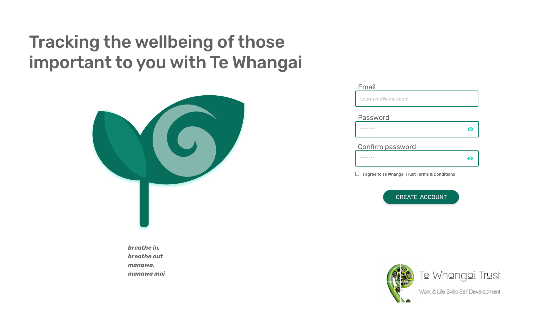
An iteration of the login screen
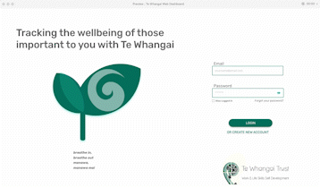
The login process for Te Whangai

Finalised Logo Design Option
The Results
After plenty of iterations, meetings and discussions, this three-month project comes to an end. We are
A video showing the prototype created. A large part of my time was spent researching and trying out apps initially but being tasked with the web design dashboard on my own was a challenge and great opportunity. I went through many iterations and found inspiration from Xero and Shopify, also taking the same colouration, font and elements of the app itself to keep a visual flow.
I found the visual construct to make a useful visual report my hardest challenge. After creating the names for the reports and deciding on a simple drop-down, a calendar selection (a comparative option would be ideal)
To further iterate this design, I would work with a data analyst and mental health professional to work on creating useful reporting for them and the future users of this dashboard to benefit the employees/ users.